
Color Your World Using Your Books Color Palette to Inspire Room Makeovers
We can breathe new life into our rooms by harnessing the color palettes from our favorite books! By spreading out our beloved volumes, we’ll identify dominant hues that resonate most with us, creating a base for our room’s transformation. Whether drawn to the calming blues of oceanic tales or the rich burgundies of vintage classics, these colors set the mood and theme of our spaces.
By marrying these tones with complementary shades, we guarantee a balanced and harmonious environment. We’ll guide you through selecting paints, textures, and accessories that not only beautify but also embody the spirit of your cherished literature. Let’s explore how these elements bring our ideal room to life.
Assessing Your Book Collection
Evaluating your book collection can reveal a lot about your color preferences and themes that resonate with you. It’s not just about the stories within the pages, but also what those covers are telling you about your aesthetic leanings. Let’s explore this together, ensuring we consider every aspect safely and thoughtfully.
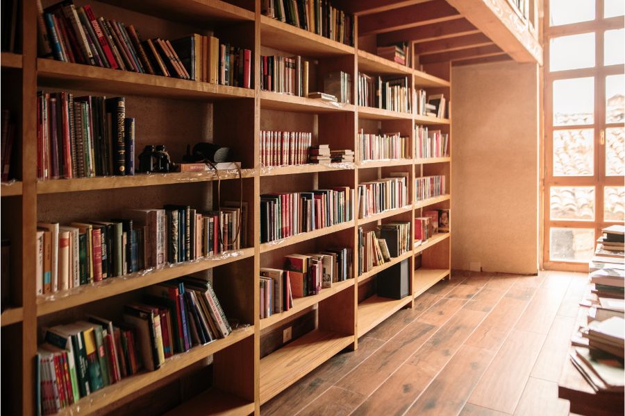
Start by looking at the books you naturally gravitate towards. Are there recurring motifs or artwork styles? These are clues. For instance, if you find many nature-themed covers, this might suggest an inclination towards earthy or botanical elements in your room makeover. Similarly, a collection dominated by vintage classics could point towards a preference for retro or antique styles.
Next, consider the emotional response the books evoke. Do they make you feel calm, excited, or inspired? This emotional cue is vital because it helps us create spaces that not only look good but feel right. We’re aiming for a room that not only reflects your taste but also offers comfort and security.
Identifying Dominant Colors
After evaluating your book collection, we’ll now focus on identifying dominant colors that stand out among your favorites. This process is quite straightforward and guarantees that the colors you choose will resonate with your personal taste, creating a space that feels both safe and intimate. First, let’s spread out your favorite books and take a visual inventory. Look for the colors that frequently appear on the covers.

These are your dominant colors. They’re likely to be the ones that you’re naturally drawn to, or that evoke a particular mood or feeling essential to your comfort. Next, group the books by these dominant colors. Do you see a pattern of vibrant reds, soothing blues, or perhaps earthy greens? This clustering will help you visualize how these colors might come together in your room.
Understanding Color Theory
Understanding color theory can greatly enhance your room makeover by informing your choices and helping you predict how different colors will interact. We’re not just splashing paint on the walls; we’re crafting an environment that feels just right. The basics of color theory involve the color wheel, a tool that shows the relationships between colors.

Colors are typically divided into three categories: primary (red, blue, yellow), secondary (created by mixing primary colors), and tertiary (made by mixing primary and secondary colors). Beyond the basics, we explore the harmony of colors. Complementary colors, opposite each other on the wheel, bring a lively contrast when used together, while analogous colors, which sit side by side, create a serene and cohesive look.
It’s not just about aesthetics; it’s also about the mood and atmosphere colors can evoke. Cooler tones might offer a sense of calm, perfect for a bedroom, whereas warmer tones can energize a space, ideal for a living room or kitchen.
Choosing Your Main Hue
Selecting the main hue for your room is a significant decision in the makeover process. This choice sets the mood and style for your space. We’ll guide you through picking a color that not only reflects your personality but also guarantees a tranquil atmosphere.
First, consider the function of the room. What activities take place there? A bedroom might call for soft, calming colors like pale blues or gentle greens, promoting relaxation and rest. In contrast, a study or home office could benefit from more energizing shades such as rich terra-cotta or deep turquoise to stimulate creativity and focus.
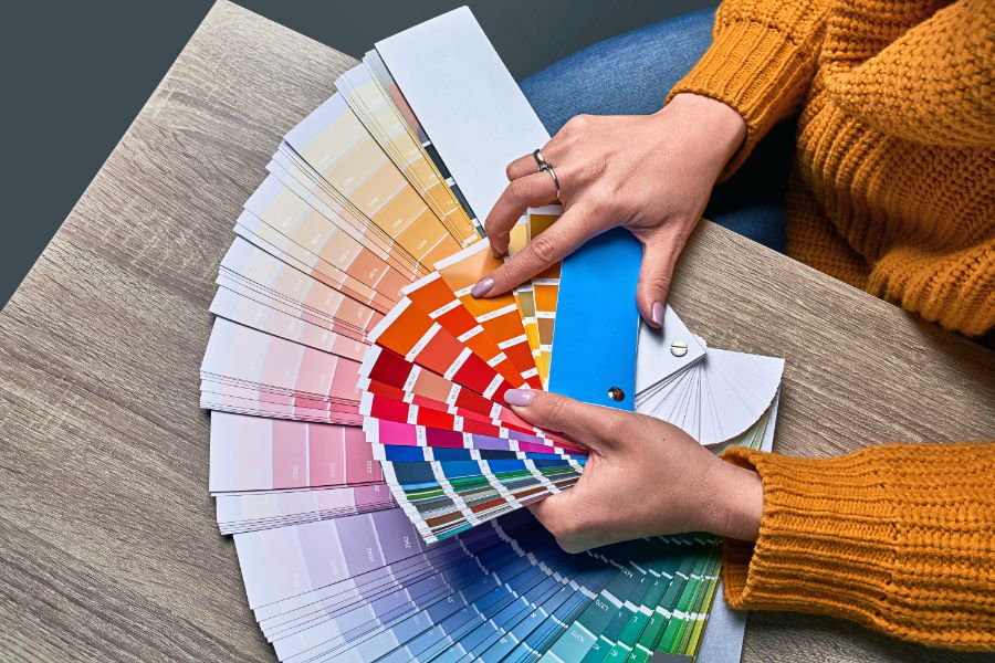
Lighting plays an essential role too. Remember, colors change under different lighting conditions. Test your chosen hue by observing how it looks at various times of the day. Paint a large swatch on the wall or use a movable board for this purpose.
This step avoids any surprises once the entire room is done and confirms the color truly works in the intended environment. Lastly, trust your instincts. If you’re drawn to a particular shade, it’s likely the right one for you. After all, you’ll be the one spending the most time in this newly transformed space!
Coordinating Colors for Harmony
Once you’ve chosen your main hue, it’s time to enhance the overall aesthetic by selecting coordinating colors that bring balance and harmony to your room. We’ll guide you through choosing complementary shades that not only soothe the eye but also create a cohesive environment that feels right.

Let’s identify colors that naturally complement your primary choice. If your main hue is bold, consider softer tones for a balanced look. For example, a vibrant blue pairs beautifully with muted grays and soft whites, providing a calming effect while maintaining visual interest. Conversely, if you’ve gone with a subdued shade, spice it up with brighter, contrasting accents that add depth and vibrancy to the space.
Selecting Paints and Finishes
We’ll now immerse ourselves in choosing the right paints and finishes, an important step to achieve the look and feel you desire for your room makeover. It’s vital to select products that not only match your aesthetic but also guarantee safety and longevity. Let’s explore how we can make these selections wisely. Firstly, consider the type of paint.
Opt for water-based or latex paints for most indoor walls as they’re less toxic, have minimal odor, and are easier to clean up than oil-based paints. They’re safer, especially in children’s rooms or spaces with limited ventilation. Next, pay attention to the finish.
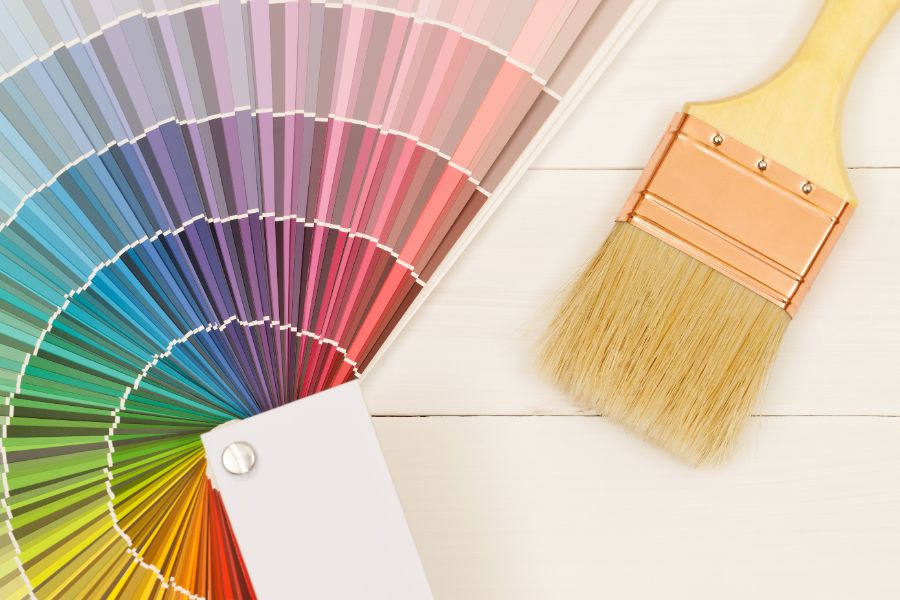
Matte finishes help hide imperfections but can be tough to clean. Glossy finishes, on the other hand, are durable and easy to wipe, making them ideal for kitchens and bathrooms. Eggshell and satin offer a middle ground with moderate sheen and easier maintenance than matte.
Always check for volatile organic compounds (VOC) levels in paints. Low-VOC or zero-VOC options are healthier for both your family and the environment. They reduce exposure to harmful chemicals and are worth the investment for indoor air quality.
Finding Inspiration in Themes
After selecting the right paints and finishes, it’s time to find creative inspiration for your room makeover. Let’s immerse ourselves in the themes that resonate with your personality and lifestyle, making sure that the space isn’t just beautiful, but also a safe haven that reflects who you are. Themes can spring from almost anything that sparks your interest.

Perhaps you’re drawn to the serene, gentle vibes of a beach-themed room, using soft blues and sandy tans to create a calming retreat. Or maybe a literary theme is more your style, where classic book covers inspire a sophisticated palette of deep burgundy and forest green, offering both comfort and a touch of elegance. Think about the emotions you want to evoke.
A room themed around tranquility might feature soothing lavender and soft grays, while a space designed for energizing might burst with vibrant yellows and dynamic reds. It’s not just about aesthetics; it’s about how the room makes you feel—secure, inspired, relaxed. Every theme carries its own unique essence and story. By choosing one that aligns with your personal journey, we make certain our space is not only safe and inviting but also deeply personal and inspiring.
Adding Textural Elements
With your theme in place, it’s time to enhance the room’s depth and comfort by adding textural elements. Textures not only elevate the visual interest but also guarantee that your space feels as inviting as it looks. Let’s explore how we can achieve this safely and stylishly.
First, consider soft furnishings like throw pillows and blankets that echo the colors of your chosen book palette. Opt for materials that are easy to clean and maintain, such as washable cotton or microfiber, which also prioritize safety for those with allergies. Area rugs in complementary tones can add warmth underfoot while helping to define different zones within the room.
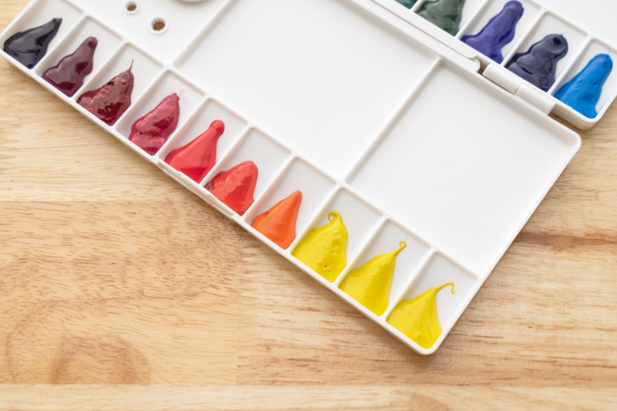
Next, think about the walls. A tapestry or textured wallpaper can add a layer of depth that reflects your literary inspiration without overwhelming the space. Choose products with non-toxic adhesives and materials to keep your indoor air quality fresh and safe.
Lastly, don’t forget the upholstery. A velvety armchair or a leather pouf can introduce a tactile dimension that invites touch while guaranteeing durability and ease of cleaning. Stick with hypoallergenic fabrics and fillings to maintain a healthy environment.
Accessorizing With Bookish Charm
Accessorizing with bookish charm, we transform our space into a reader’s paradise. By carefully selecting book-themed decor, we guarantee our homes not only reflect our literary tastes but also offer a safe and inviting atmosphere. Here’s how we can infuse our rooms with a touch of literary magic:
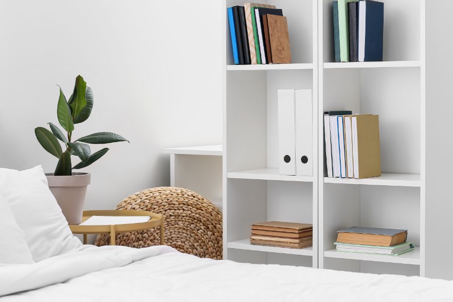
- Custom Bookshelf Arrangements: We organize our shelves not just by genre or author, but also by color and size, creating visually pleasing patterns that enhance the room’s aesthetic. Safety is key, so we guarantee that shelves are securely anchored.
- Literary Art Pieces: We choose framed quotes from favorite books or illustrations from classic literature to hang on our walls. These art pieces serve as great conversation starters and add a personalized touch to our decor. We opt for secure hanging methods to maintain a safe environment.
- Thematic Accents: We incorporate small, themed accessories such as a vintage typewriter or a globe to complement our book collection. These elements are placed strategically to avoid clutter and guarantee ease of movement around the room.
Real-Life Makeover Examples
Now let’s explore real-life makeover examples that bring these bookish decorating ideas to life. Imagine a cozy reading nook that we’ve transformed using the vibrant greens and earthy browns from a beloved classic, *The Secret Garden*. We’ve applied soft green on the walls and incorporated rich wooden furniture to echo the garden’s natural elements, creating a safe, serene spot for escapism through the pages.

In another room, inspired by the fiery passion and icy deceit in *Game of Thrones*, we’ve dared to blend deep blues and stark grays. The furniture follows a medieval aesthetic with modern twists—think robust tables paired with sleek, metallic accents. It’s a space that balances intrigue and comfort, ensuring it’s both stimulating and secure for family gatherings.
Lastly, we’ve taken cues from the whimsical palette of *Alice in Wonderland* for a child’s bedroom. Bright blues, playful pinks, and dashes of yellow make it a cheerful space that stimulates young imaginations while ensuring the environment remains comfortable and protective. Each example shows how books aren’t just for reading—they’re a source of inspiration for safe, personal spaces that tell their own stories.